HouseBloom App
Case Study
-
Product
I have designed this product to allow users to easily order one-time occasion flowers or monthly flowers without having to drive in busy traffic to an in-person flower shop.
-
The Problem
It is inconvenient to drive to an in-person flower shop to buy bouquets and unenjoyable to use floral apps that have too many options and poor branding.
-
Goal
Create an simplistic and attractive app that allows users to easily buy monthly or occasion bouquets with clear navigation cues.
-
Project Duration
January 2023 - April 2023
-
My Role
Lead UX Designer, Researcher
-
Responsibilities
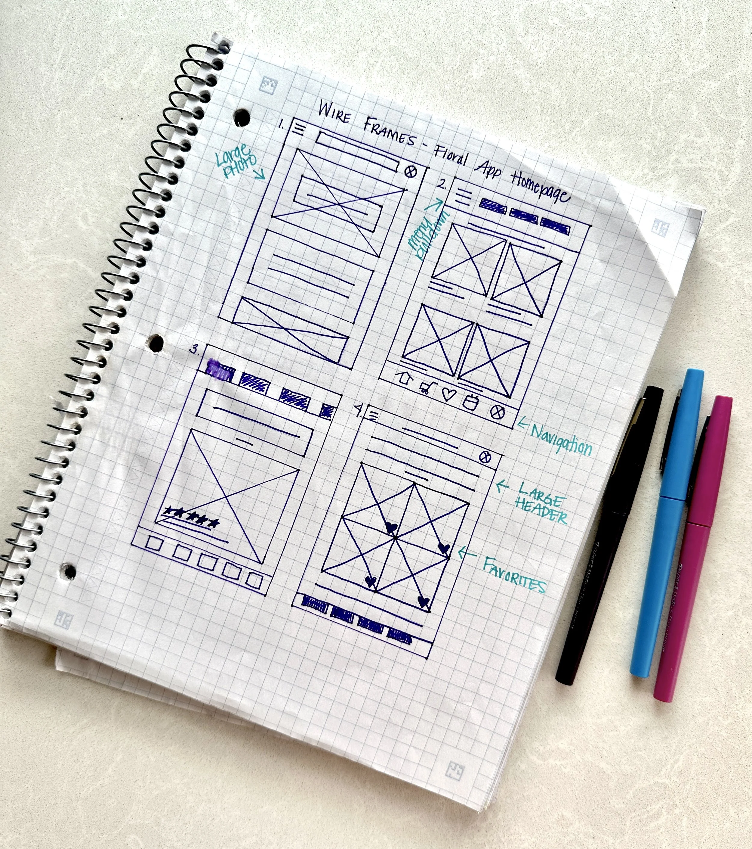
User research, wireframing, prototyping
Preliminary User Research
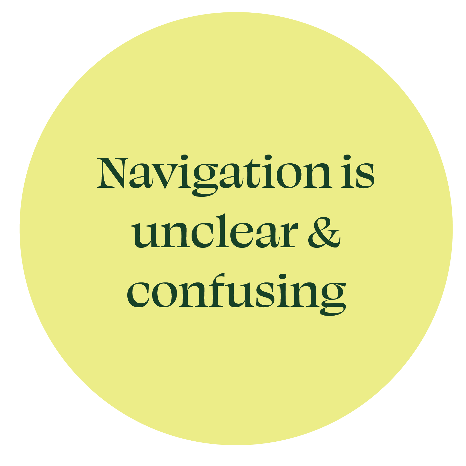
Before starting the design process, I wanted to understand what kind of experience the user wanted to have while using a floral app and what their frustrations are with current apps. I found three main pain-points.
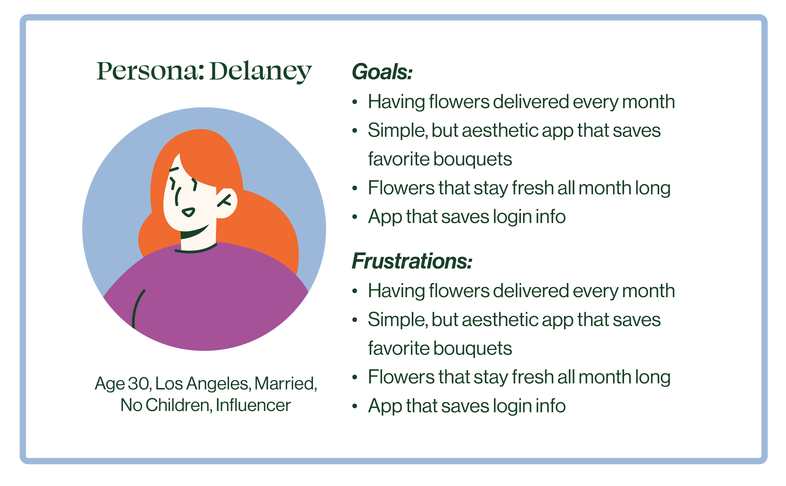
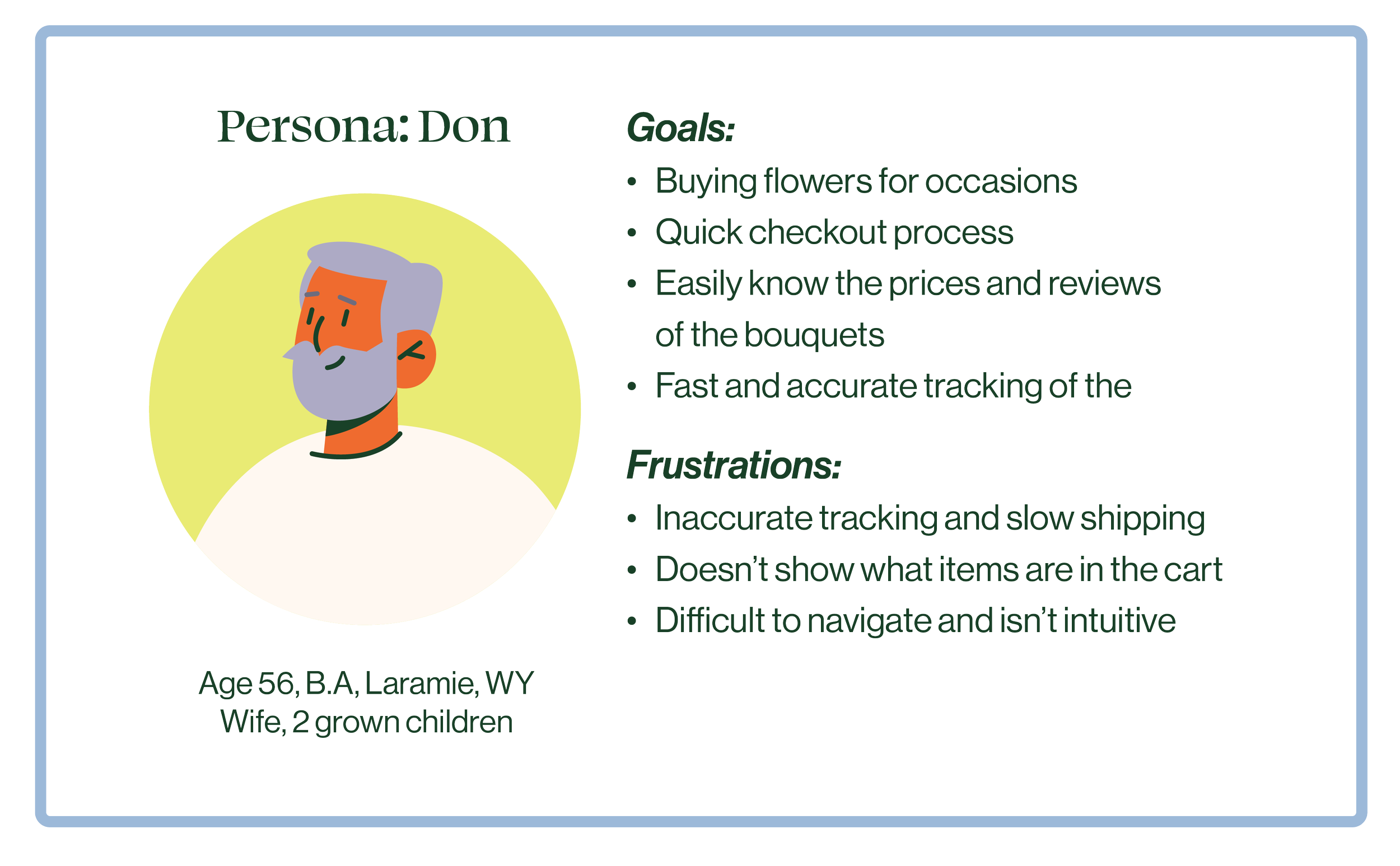
Based on the initial research, I created personas and their problem statement
Delaney is a successful influencer who needs a monthly flower delivery subscription where she can customize her preferences because she’s frustrated by having to reorder every month.
Don is a hardworking family man who meeds an easy way to place an order for flower deliveries because he doesn’t have time to go in-person to a flower shop.
Usability Research
Round 1 Themes
Round 2 Themes
Mockups
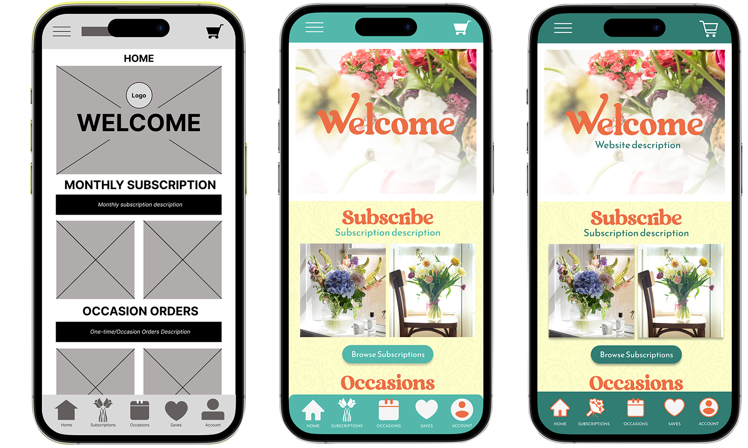
Added buttons to move user through to next step
Darker green for higher contrast
Updated subscription icon
Modern & simplified cart icon
Icon colors consistent throughout
Fixed menu while scrolling
Check it out here
-
Impact
The app allows people of all demographics to easily order flowers and customize their experience. Both subscriptions and one-time occasion bouquets can be seamlessly ordered.
-
What I Learned
During this project, I learned to conceptualize how a user moves through an app and how to accommodate people of all different abilities, preferences, ages, and needs.
This was my first project navigating Figma and Adobe XD. I learned how to make buttons interactive, how to create connections between features, and the industry-standard spacing for mobile UX design.
-
Next Steps
If I were to make further edits, I would make the app more interactive by adding a calendar scheduler and adding more product choices.

