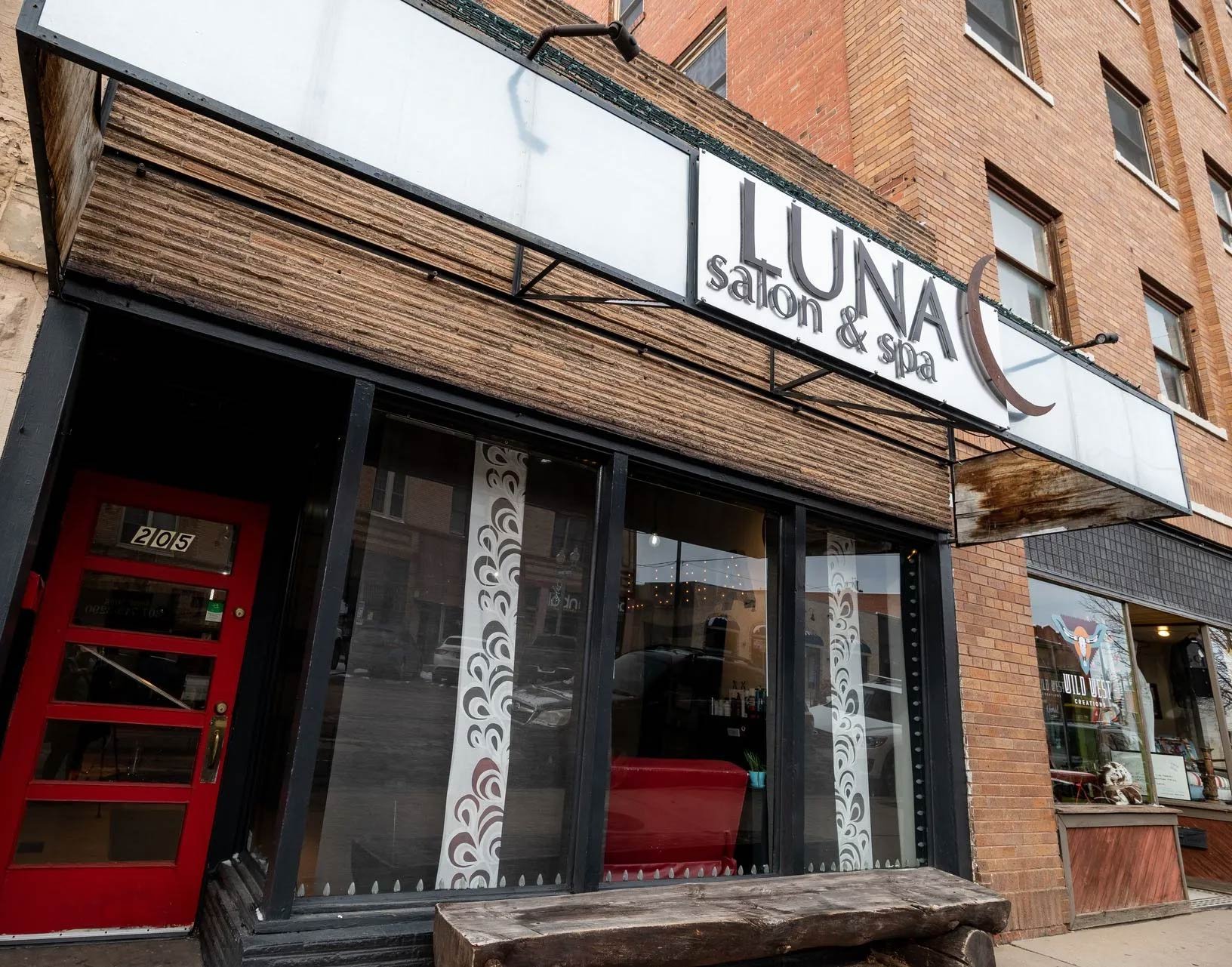
Luna Salon & Spa
Title:
Founding Designer
Year:
2016-2023
Brand & logo design
-
Hometown, friendly, rustic, sophisticated
-
Warmer red and rust. Accented also by salon furniture and salon fronts
-
For the primary font, we chose a sans-serif that was bold and classic. The ends are slightly curved which compliment the moon.
The secondary font is more delicate and feminine in contrast with the primary.
Core Elements
2016
Current Luna Logo
Current Eclipse Logo
-
In 2016, the logo had a purple moon instead of the current warm rust moon. Additionally, the "Salon & Med Spa" text was enlarged. The font was changed to Marion, which is a delicate and less bold font.
-
Over the years, Luna has become so successful, that they have expanded to three locations - one with a new name Eclipse. Eclipse has the same font and moon.


